Well my seven weeks in web design are up already! The class went so fast, too fast. I enjoyed it all and really learned a lot more than I thought. Being an artist I was already used to noticing bad advertising and ways to improve on that but the rest of the class was so informative. I think if I had to choose one thing that I will take from the class and use throughout life, it would have to be the photo-editing aspects. Using Photoshop was so wonderful to learn and I am still amazed with what can be done with the program. I have already used it a few times with making changes to tattoo images that I created last week and will surely continue to use it for future designing.
So this weeks homework was to finish our personal web site projects. I'm so excited about this, it couldn't have come at a better time for me since I was planning on starting to tattoo again on the side and needed a web page for gathering new clients. Last week our in class assignment was to create our web site using Frontpage editing program which was nice but I really enjoyed using Webnode for creating my finished site. My only complaint about working with Webnode is that I had trouble letting the computer alone! I just kept wanting to tweak everything and I did and will continue to do so. I really love the completed site, I have a lot more pics to put up but for the most part I plan to use it for a long time to help with my tattooing business.
One thing that surprised me the most with the class was finding out about all of the free web 2.0 applications that are available. This blog page for example, such a great way to keep in touch with everyone on your own time. The web site that I made is another great web 2.0 example, free to use and set up and it will be a huge benefit to have for a side business.
For the site that I needed to create for class, we learned that it is best to make up a storyboard first so that you have a basic idea of what you want your page to look like and it takes the guesswork out quite a bit. I kind of did things backwards but I feel it worked out for me though. I used Webnode as my storyboard and then created my Frontpage site off of the one that I set up in Webnode. I still wrote things down on paper and had to modify things because of program differences but overall the pages have the same color scheme and feel along with the same basic concept of being for tattooing. I know I said it before, but I do really like my web page!
Final thoughts of my web design class, I loved it and highly recommend it to anyone in the program. Such a wonderful tool in today's fast paced world. I must say that as bad as it sounds, I was sceptical of taking the class but I can honestly say now that I am so glad I did. So if you want to see what I have learned over the last several weeks, or if you are interested in getting a tattoo, check out Red Lion Ink at http://www.redlionink.webnode.com/
Sunday, July 12, 2009
Sunday, July 5, 2009
Week 5 - Red Lion Ink is born
Week five we were to gather our thoughts on what web site we wanted to create, well that's easy. I have been a professional tattoo artist for the last fifteen years and have partnered three studios along the way. I am not currently working out of a studio because of my family, I certainly do not mean that in a bad way either, it just isn't an easy business with children, a lot of long hours and I enjoy being with my family way too much to be stuck at a tattoo shop from noon till whenever.
So back to the web page, Red Lion Ink is what I named it and really that name came about as a joke. My wife's uncle has always called her "pink" and when we first started dating he thought he was clever by calling us "Pink and Red Lion Ink," so I figured why not just go with that. As far as the collecting images for Red Lion Ink, that won't be a problem, I have quite a few pictures of my tattooing over the years. For me it was harder to choose which ones to use so my project doesn't get out of hand with too many pics.
I do not have an html editor program on my computer so that left me having to storyboard to help create my web site, well that's what I was required to do anyway. I actually started this project backwards, I made the second web page first and I think it really helped with my storyboard layout. I plan on keeping my second web page and using it since I still tattoo part time when I have the time, so that one will be more elaborate with more pictures and different pages I think I am already up to ten pages on that one. As for the in class html page, I plan to have four pages maybe five pending on the time crunch. I am mainly just using the site to show the tattooing that I have done and basically advertise myself a bit. Since I don't tattoo full time anymore, it will be nice to just give someone a business card that has only a web address on it as to my personal phone number. The overall look that I want to go for on both pages is clean. I just want a smooth clean site that is easy to navigate, I really like the color combination of red, black and grey so I think that is what i plan to work with for my html page.
I could go on and on but that answers most of the questions as to what and how I plan to design Red Lion Ink so the real test comes next week when I officially unveil the web address for everyone to see......
Monday, June 29, 2009
Week 4- Gettin' Down and Dirty!
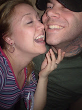
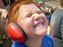
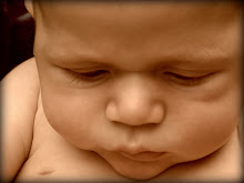
Homework, that pretty much sums up the week in review. I loved it all though! I finally downloaded the free trial of Photoshop and was so glad I did! That program is amazing; endless possibilities as to what can be done with a photo or from even a blank canvas. My only complaint about it though would be that it takes away from just being a good photographer because of all the things that can be added or removed from any picture. So back to the homework, had some minimal reading this week, a bit from our Non-Designer's Web Book and some online sites to check out. But the fun part was our graphic lab! One part of the assignment was to add a picture to our blog, now I have added a few but to be safe I thought I'd show two shots of my weekend with the boys in a posted blog.


OK back to school, the other part of homework was a couple projects using Photoshop. These were a blast to do. I really could have spent my whole weekend "tweekin" each one but as you can tell from my pics, I don't have a lot of extra free-time. I certainly won't go into detail on the "how-to" aspect of the project, but I transformed a photo of a house taken during the day and changed it to look like the photo was taken at night! The other one that I did was changing a picture of just an open hand to a hand holding fire! Crazy what can be done with Photoshop; if I ever get extra money that I don't know what to do with, or should I say extra money that my wife doesn't know what to do with, I'd certainly buy the program.
Busy weekend of firsts for them both! I took Branson my oldest to his first professional baseball game in Baltimore on Friday night and the other pic would be Emerson my youngest getting his first experience with dirt! I'm building a deck at my house and just couldn't resist setting him in a wheel-barrel full of dirt and he loved it!
OK back to school, the other part of homework was a couple projects using Photoshop. These were a blast to do. I really could have spent my whole weekend "tweekin" each one but as you can tell from my pics, I don't have a lot of extra free-time. I certainly won't go into detail on the "how-to" aspect of the project, but I transformed a photo of a house taken during the day and changed it to look like the photo was taken at night! The other one that I did was changing a picture of just an open hand to a hand holding fire! Crazy what can be done with Photoshop; if I ever get extra money that I don't know what to do with, or should I say extra money that my wife doesn't know what to do with, I'd certainly buy the program.
Our reading homework for this week that I had mentioned earlier was based around what web pages are and things to know before designing a site. Pretty cool information, a lot of the nitty-gritty technical stuff defining what things do and how they all work together when creating a web page. It is amazing how anyone can create a web site; there are even free programs to do so, yeah free. Computers are a wonderful tool, almost a necessity in today's world but I don't think it is a good idea for everyone to have a web site nor do I think it is necessary. I do enjoy the blog pages and I think they are great for keeping friends and family "in the loop" but to me if you don't have a business or information that people need to access then I think Grandma can move her web page of her Grandchildren and cats to a blog as to her own page on the web!
If you are going to create you're own web page, doing it yourself has obvious advantages. Like I had mentioned already, free programs. Why pay someone that can't physically see the vision you have for you're site when you can do it for free? That alone is reason enough for creating you're own page as to hiring someone but as it seems with everything, there are drawbacks to just jumping into web design. First off, it is a very technical process and quite time-consuming. So you have the free time you say? Well another downfall is the know-how. You may be able to navigate through a web design program and post a site on the Internet but there are a lot of little things that can change a good web site to a great one and that takes practice and know-how which obviously you wouldn't have on you're first at bat, sorry still on the baseball mind-frame.
All in all web design comes down to usability and accessibility. Usability is when the site comes together properly and is easy to navigate and understand. A lot of sites have all the information to make it a good site but if a person can't navigate through it with ease chances are they will close out of it and go to another site that they can understand and quickly get what they wanted. Accessibility is just as important but with different reason. If you make a page for deck building but name you're page "chillin and grillin" chances are no one will find you're how-to page on deck building when they run a search. Although it is fairly simple to make you're own web page, if it isn't accessible or user-friendly you'll just end up striking out!
Sunday, June 21, 2009
Week three. Go Falcons!
Did you hear the news this past week? The English language is now up to one million words! I only mention this because the irony of the one millionth word in relation to this class is hysterical! The newest word, are you ready? Web 2.0! Can you believe it! Now I personally don't think this should be considered a word but it is, and I thought it was too funny hearing this, just had to mention it.
Week three already, going so fast. I loved the html homework, couldn't believe all the cool things that can be done just by typing code. I really had fun playing around with the vocab page, I was kind of bummed when I saw that it was only worth ten points, I'm still proud of it though. While I'm on the subject of homework, I hate Gimp! Now I'm sure that it is a great graphic tool, but since we have been learning everything in Photoshop, I can't stand trying to figure out the correct wording for what I know how to do and just don't know where it is in the Gimp program! I think that I am going to try the free trial of Photshop because Gimp was really stressing me out this week. Anyway, I enjoyed the reading, still plugging away with "The Non-Designer's Web Book," good information on good and bad web designs. I felt that everything is explained very well and easy to comprehend. The topic did get a bit repetitive though by the time I finished reading the web pages from Diigo.
So this weeks blog is to have two web pages that I "evaluated" with my new knowledge from the weeks reading. I really do not "surf the web" at all, which kind of made this blog difficult, mainly because I have no idea what sites to look at. So I decided to use a little friendly competition with my choices. We are football fans in our home, that is the only sport, just football. That being said, my wife is a Steelers fan (booooo!) which makes things interesting because I am an Atlanta Falcons fan! I know what you're thinking, GOOOOOOOOO Falcons! Since pre-season is right around the corner, well more like two months but close enough, I thought why not compare the two teams web pages.
I'll start with mine, http://www.atlantafalcons.com/ Now for both and only for this assignment, I will be evaluating with a non-biased opinion and will use the same criteria to make judgements on good or bad design. The criteria that we have learned with evaluating web pages are authority, purpose, currency, objectivity and accuracy. Overall these things fall under the "crap" logic that I discussed in my week one post. When looking at the Falcons page, it has a great appearance and overall feel to the site. When you first log on, everything you need to see is right there, centered and without the need to drag the page side-to-side for viewing. The home page has a search engine, menu bar and up-to-date info right from the start. Each page continues the same feel throughout the whole site and it is very easy to navigate back to the home page since the menu bar is located in the same place throughout the site. I feel that the Falcons web page falls under an example of a "good" web design.
Now for the other, http://www.steelers.com/ (booooo!) What a mess! I really have no idea where to begin. Everything on the home page is a link or an advertisement, there is a busy ticker that just distracts me right from the start, the whole page is set to the left of the screen, fan or not this is a bad page! The first search engine you see on the home page takes you to any other team in the NFL, now I understand why, mainly because you must have stumbled to the Steelers page by mistake but come on, why would that be the first thing I see? Once you are able to find the navigation bar (located on the left) if you click to another page there is not a visible link to get you back to the home page. Every page is filled with busy things and loads to look at and click to. I feel this to be a disaster and certainly an example of "bad" web design.
For the record, I am being non-biased, really I am, the Steeler page is just a bad set-up but will at least give me ideas of what not to do when creating my own page. After reading the homework for this week I certainly feel that I look at all web pages much more critically and will continue to do so from now on. With the information that I have already learned from this class I think there is no excuse for bad design, you just have to take the time to make it right along with having a friendly design so that everyone, yes even a Steeler's fan can enjoy what the page has to offer.
Monday, June 15, 2009
Week 2 in review
So week two was right down to business! Our class went well, reviewed some terms that we all had to define and messed around with "Photoshop" a bit, then ended by reading our syllabus for the weeks homework. I thought wow, not bad just some reading then blog..... wrong! The reading was pretty intense this week! Nothing devastating, just full of numbers and equations, terms and definitions, examples with captions?! I enjoy the book, oh we're still reading from "The Non-Designers Web Book," for me though I don't appreciate how the book defines things then adds that you really don't need to remember that, just thought we should give you a definition because you'll hear it a lot. I just think that is weird.
I did get a lot from the reading this week, really cool facts that clear up some "I wonder why" questions from in the past. I have worked for a printing company in the past so I knew about CMYK (Cyan, Magenta, Yellow, blacK) but didn't know about RGB or Indexed color. For me it was nice to read that if you want to make the file size smaller one way is to index an image and when doing so, you can choose the color palette. The part about Bit depth was a bit in depth. I'm still in a one bit world that's for sure! From there we read more about gif"s and jpeg's, cross platform fonts, cascading style sheets and so on. The underline point (which you have to be careful when using underlines) is resolution. From my findings, resolution quietly runs or truthfully, slows down the computer world.
Resolution in both print and monitor resolution are important, but complete opposites. The higher the dpi (dot per inch) number the better the print quality but choosing the lower number for monitor resolution will give you better visual quality. Recommended pixel setting in between 72 or 96 for images to show up best on multiple computers and configurations. Resolution is even necessary with everyday computer use. I now know that it is important to make changes to a digital picture prior to sending it to a friend or adding it to my blog. Really it just makes sense and is fairly simple to do and while you're at it, why not make a good picture into a great one! The main focus on getting a photo "web ready" is to make it easier to use and view. so like I mentioned earlier, first thing, set the resolution to 72, this will shrink the photo to a smaller size right from the start. Next re-size the photo itself. Crop it, cut people out, whatever you want really, just make the actual focus and purpose for the pic be known and at the same time you'll be making the file size smaller. Now pending on what kind of pic you are sending, you can shrink the file size even further by choosing to index an image. I explained this earlier too. On the same line, you can choose the quality of the pic, does it have to be high quality? Most e-mail or blog photos would be just fine in a lower setting which again will shrink the file. After these few changes, it is important to choose the appropriate File format. By choosing the correct format such as giff, or jpeg, you will be able to keep the overall quality of the picture as well as not taking up too much space on a web page that is being loaded for your viewer.
So with that said, I needed to try out some of these things for "hands on" experience. I tried to edit some pics in the free photo editing site of Picnik for starters, not a fan. My wife is able to use this site and use it well but I didn't like the feel of it compared to Photoshop since that is what we use in class. I then downloaded Gimp. What a difference! It is very similar to Photoshop just not as smooth. Some of the terms are different and harder to find but overall it has most of the same features and I can't complain....... it was free!
Sunday, June 7, 2009
Week 1 in review
So we started the class with the idea of web design being based around a lot of "crap." Now before you think I'm downing the class, "crap" in the graphic design sense is a loosely used acronym for contrast, repetition, alignment and proximity, aka "crap." This is a very true statement; without all the proper "crap" there would just be a mess of designs all over the web and in print. When using contrast throughout a web design one must ensure at least two of the elements are really different and should remember to not be "wimpy" on how the differences are displayed. Repetition is important when a web site has multiple pages to keep the person viewing the site aware that all the pages are connected. Color, fonts and images are great examples of methods that show repetition throughout a site. Alignment is also important so that a viewer doesn't have to jump all over the page to read or view what the site has to offer. The main rule for Alignment is to find what you're comfortable with and stick to it. Proximity is what ties all the elements of "crap" together. The site should be grouped together according to importance and keep texts describing images close to the actual image giving viewers a visual clue of how you want the site to be perceived. If all of these principles are taken into consideration when designing a web page or print ad they will prove to have better results, even if the site is just for entertainment.
Part of week 1 homework was to read from the book "The Non-Designer"s Web Book." The book is basically set up like one of those "for dummies" books and is amazingly helpful. I am far from a computer person, not that I don't enjoy what one has to offer, just never had a big need to use a computer prior to me going to college. That being said, this book is shedding a lot of light on the basic things that I thought I already knew and understood. So far with the book we covered things like what the web is, how to navigate around the web, browser use and differences and how to search through the Internet (this was good for me because I get easily frustrated with "searching"). From there we read some sites and a chapter about print vs. web. This was quite interesting how different the two are and yet they can really work hand in hand if used properly.
Overall with week 1, I have learned that graphic design plays a big role in my daily life. One of our other assignments was to cut out two "good" ads and two "bad" ads using our newly learned knowledge of how something should look. Through this process I found that if ads are not set up properly you tend to just cruise right past them missing the whole point of whats being advertised! I noticed that even billboards have to follow these correct principles or they won't get the point of what they are trying to sell or market because of the short amount of time you get to read them. Same thing goes for web pages, if you click to a site that just looks like a mess or doesn't load fast enough, chances are you'll just skip it and move on.
In just one week my understanding of design for the web vs. print has improved dramatically. When you design something for print like an ad, you're designing something that can be held and you can take the time to read and look at. Ads are normally just a portion of a page mixed in with other ads and a lot of time you don't concern yourself with the overall layout; you read what you need to know and move on. With web design it has to be user friendly, has to be attractive in a sense or a person will just skip to the next available site on the topic. The way to achieve proper attention is with a well laid out page and if it is going to have multiple pages, make sure they all appear as one flowing site that is legible and full of "crap."
Subscribe to:
Posts (Atom)